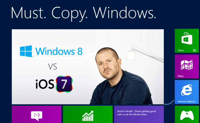
It's been just a week since Apple announced iOS 7, but the hype it triggered in the tech press, as well as among iPhone and iPad users, has already reached unprecedented proportions. Surpisingly, the close similarity between the new iOS and Microsoft's Windows 8 and Windows RT went largely unnoticed, while the core design thinking behind both of them is largely the same. I've taken some pains to fix this.
The major interface overhaul with a heavy stress on flat surfaces and light neon colors marked a major milestone in the history of the world's second-popular mobile operating system. Coming at the cost of Apple's characteristic skeuomorphism, the new iOS design still remained recognizable enough to ensure continuity with the older system versions. Nevertheless, the break between the well-establshed conventions and what Sir Johny Ive presented a week ago was deep enough to brew frustration among users.
Exactly the same thing happened to the billion of Windows users a year and a half ago as Microsoft announced Windows 8 and Windows RT: their world turned upside down as the good old desktop gave place for Metro... erm... you know, this live tile thing that used to be called Metro. No icons, no Start button, no Explorer – no way! But the design is not the only point of convergence between the two systems. What they look like today is actually a result of the long cross-fertilization with ideas between Apple and Microsoft.
 Apple's iOS 7 (left) and Microsoft's Windows Phone 8 (right)
Let's take a look at just a couple of similarities between the iOS and Windows RT and try to figure out whether they're both parts of one general trend or just parts of a quirky coincidence.
Design
The full list of similarities between the two mobile OSs is quite long, but we'll talk about just two of them.
The first thing that strikes you when you look at Windows RT and iOS 7 put side by side is how similar their fonts are. They are not merely similar: I don't know about you, but for my non-designer eye of an amateur, they look pretty much the same. And big. No, not big: really BIG, especially compared to the tiny-winy titles in the desktop Windows and OS X. This megalomania is weird. Of course, the focus on the typography is the raison d'être of the Metro design language, lying at the heart of Windows 8 and, apparently, iOS 7. It's okay when you are trying to stay true to your own principles, but it doesn't immediately mean you have to stick them right under my nose and cry, 'Look, our design is about the typography, T-Y-P-O-G-R-A-P-H-Y!!!' As a result, the overall space occupied by a single text block on your page is way larger than it would be in a more traditional interface. It becomes especially obvious if you contrast the Mail app in the new and old version of iOS. I don't know why they did it, maybe you do?
 Mail in iOS 6 and iOS 7 side-by-side (Source: osxdaily.com)
Another important point to mention is that Windows RT and iOS 7 feel flat, flat as a tyre. The traditional desktop OSs are virtually permeated with spacial metaphors. The app dock in OS X, good old program windows, extensively used shadows – all of these give you an immediate feeling of depth and 3D. This 3D interface allowed for emulating the look of real-world devices, making the learning curve for the operating system less steep. While the old iOS versions extended this skeuomophic paradigm ad absurdum with the Calculator and Podcast apps on iPhone, iOS 7 breaks off with the spaciality, bringing in the flatness instead. Well, just like Windows 8 and Windows RT.
To be more precise, both systems do not feel all that flat. The tiles and icons in Windows RT and iOS 7 resepectively are not pinned to the main screen background; Apple has even come so far as to make the background move. Still, there is no space in it, the interaction between the icons / tiles and the background comes across as two separate flat surfaces rather than a fully fledged 3D environment. There's just no space in it.
Concept
Even though Microsoft seems to be the design trendsetter in its tandem with Cupertino, it was undoubtedly Apple who first outlined the general concept of what a mobile OS should be like. For instance, Windows Store is a twin sibling of iTunes Store, serving as the only legit channel through whiÑh a user can get new apps. Both iOS 7 and Windows RT are strongly consumption-oriented and provide relatively few creative opportunities to the user. Both OSs are conceived as closed environments under full control of Apple or Microsoft. Both of them make use of a different processor architecture than their desktop counterpats, making the device syncing a real pain in the neck. But most improtantly, both of them tap on different income sources in comparison with the desktop.
 App Store (left) vs Windows Store (right)
The traditional OS sales model suggests that the user purchases the system from a vendor and this accounted for most of the developer's profit. Apple was the first to introduce another business model for the OS monetization by making their App Store the only app outlet for iOS and thus getting its profit share in the sales of third-party software.
Microsoft, who has irreversibly missed the start of the mobile boom, is now trying to make up for its sluggishness and apparently sees the Store model as the most promising cash generating machine. In fact, it should be even more promising in the eyes of many Microsoft executives, seeing that they decided to sell Windows RT Surface tablets with Office pre-installed. A customer buying a Surface Pro with Windows 8 is stripped of this privilege and has to purchase the Office package for the aditional $399.99 (the Professional edition). These four hundred bucks for Office are certainly partially covered by Surface RT price. However, at least part of this sum is supposed to be refinanced by the money paid for Windows Store apps. It doesn't seem to be working really well, as the number of apps in the Store is lagging far below the App Store figures (clocking in at about 50,000 apps this March).
Cross-Fertilization
No matter what the Windows Store sales account to, the similarity of the Windows RT concept to that of iOS cannot be ignored. No matter how fresh and cool the new iOS 7 looks, the similarity of its interface with that of Windows 8 cannot be ignored either. Looks like we are facing a very interesting and rare phonemenon: creative cross-fertilization of competition. Is it a general trend? Well, Android doesn't really think so.


I am an hobbyist designer and I own an iPhone 4S, and the skeuomorphism always annoyed me. First time I tried in my hands a Nokia Lumia with Metro UI and its minimalism, I was impressed.
Of course in my opinion nothing can beat iOs experience, so just welcome iOs7 and Mavericks.
And your opinion of cross-fertilization is simply your own without any facts.
If it were true, lawsuits would have ensued just like it has previously happened between Apple and Microsoft in terms of GUI where Microsoft won and Apple got zilch.
You can read about it on Wikipedia at http://en.wikipedia.org/wiki/Apple_v_microsoft
As for the creative cross-fertilization, I don't mean Apple or Microsoft were dumb enough to steal each other's ideas outright. It's pretty much like the ostensibly plagiriazed iPhone design: on the one hand, you can argue this design is practically the only one possible if you start creating a new smartphone; on the other hand, there is Nokia Lumia that looks great (my personal opinion) and is still very different from iPhone in the terms of design. Has Samsung really plagiarized the notorious 'look and feel' of Apple products? I don't know.
What I think is that both Apple and Microsoft mutually used their ideas as a source of inspiration. It's not that Jony Ive would tell his team, 'See this Metro font? Let's use the same one in iOS 7!' or Ballmer would say, 'Copy iOS!' What I believe they said was, 'Look, it seems to be working just perfect, why not implement something similar in our own products?'
That's essentially what the article boils down to.