 Skype's redesigned interface is now rolling out to PC users
As you've probably noticed, a few months ago, the mobile version of Skype got redesigned to make the application more competitive with other communication tools such as Snapchat or Slack. Now, Microsoft has finally started to roll out these changes to desktop users as well, making them available on Window as well on Mac. The new design has been in testing since August and the IT giant took the users' opinions into account when deciding which features should be prioritized.
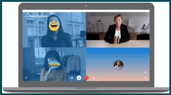
The new Skype interface shows a much stronger focus for social interaction (especially expressive tools such as emoji or stickers) and sharing media files. In this latest version status updates have made a return, each person from a group chat now has a personal color and reactions are available for each text line. Additionally, the interface itself is a lot more colorful and has customizable themes, large emojis can be used during voice calls and temporarily overlaid on the screen, there are media galleries for each particular conversation, @mentions can be employed to make a specific person pay attention and the application now includes GIF as well as bots support. As far as noticeable absences go, the biggest one is the lack of Highlights, a feature similar to Snapchat's Stories, which hasn't yet been ported to the desktop mode.
As far as personal opinions go, I didn't particularly like the overhaul on mobiles, so I probably won't like the desktop version too much either. Nevertheless, the newly added functionality can be really appealing to the younger demographic, something that Skype's already existent tricks didn't appear to be doing.
