Looking for a non-default office suite? Kingsoft Office is so-so, the LibreOffice UI is obscure, IBM Lotus Symphony is great.
***
Last weekend, I came across some statistics reflecting how much time an average person spends doing this or that in their lifetime. So, out of 70 years of lifetime, an average person spends about 23 years sleeping, about 6 years eating, and, with a sufficient amount of luck, about 2 years being sick.
A legitimate question arises: and how much time do we spend working? According to the statistics I read, about 19 years - i.e. 4 years less than sleeping (yea!).
However, my nerdy mind didn't want to stop at that point and went on constructing increasingly geeky inferences: “Today, most people are 'clerical and kindred workers', at least in the countries where there is more than one human being per a square kilometer. It follows then that most people in the developed countries spend most of these 19 working years at computers. And what software do they use most often? Surely it's office software suites.“
As I made this conclusion, I plunged into the state of deep sadness. Not that I deplored that people spend so much time working with boring software (you've got to have Philip K. Dick's imagination to find the office suites entertaining). Neither did I regret that I apparently spend way more time messing with videogames, like Minecraft or Skyrim.
What I pitied was that there are so few articles about office suites. IT journalists write about everything: they chew every single tiny interface change on Facebook, lead prolonged discussions about whether Siri can save iPhone 4S from being so unoriginal, and devote 15,000-character articles to another video game. But as soon as it comes to the office suites, the only thing the same IT journalists write about is that there is such and such pack or that a new release of X Office Suite has been announced.
Being an IT journalist, or, at least, thinking myself to be one, I decided to atone for this sin and review some office suites.
After consulting Wikipedia, I understood that their number is so massive that I could spend months reviewing all of them, so I narrowed down the area of consideration to free and shareware multiplatform suites, since they are blissfully few and do not include the all-pervasive Microsoft Office, which all of you are sure to know inside out. After giving the problem a second thought, and after a bit of extensive googling, I opted for three productivity program packs: Kingsoft Office, IBM Lotus Symphony, and Libre Office.
1. Kingsoft Office
As I learned that this suite is of Chinese origin, I expected to find see some roughly cobbled piece of software (no offense to the Chinese, but their software looks that way much more often than it would be acceptable). Instead, I got a sleek-looking suite, which was, however, 'somewhat' similar to older versions of Microsoft Office.
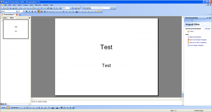 Kingsoft Office: Looks a Bit like the Old Microsoft Office
To tell you the truth, the pack's similarity to the exorbitantly priced famous suite was the reason for my being not very pleased with Kingsoft Office. On the one hand, it's nice to realize there is some continuity of traditions on the software market: using an interface terrifically close to that of Microsoft products should make the transition from the Redmond suite for new Kingsoft users as painless as possible. On the other hand, after the emergence of ribbons in Microsoft Office 2007, using the old menu-and-tabs system UI in a commercial software suite is considered something from the Stone Age. It can but stagger you when you pay 40 bucks for a program and get something so blatantly obsolete as this bunch of unmanageable icons, inobvious tabs, and mysterious menus. I mean, guys, if you are inspired by the Microsoft Office UI, why don't hold the latest one for the model?
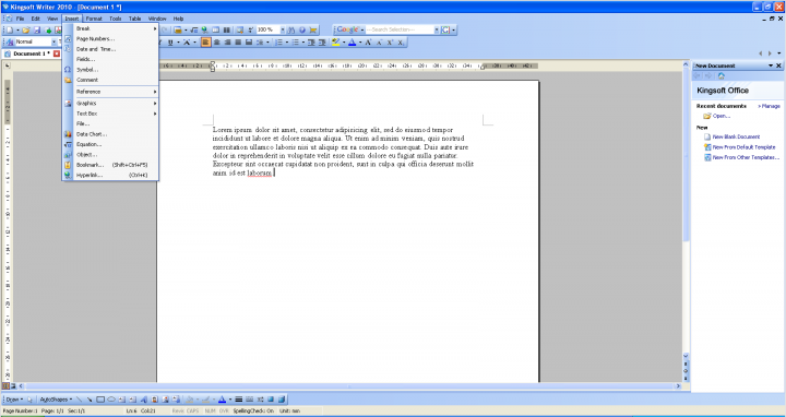 Kingsoft Office: A Very Intuitive Interface
2. IBM Lotus Symphony
I've fallen in love with this suite. Honestly, it features so many simple and interesting managing solutions that it's hard to believe nobody has implemented them in other productivity packs (isn't it, Microsoft?).
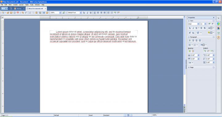 IBM Lotus Symphony: An Office Suite Designed Like a Browser
First of all, I loved the idea of designing the whole suite as a browser. I think about 85% of the swear words I uttered in my whole life are accounted for switching between Microsoft Office files in Windows 7. The revamped taskbar in this OS saved us from hordes of tasks occupying the bottom of our screen; but in the previous Windows incarnations switching between various Office files was much faster, since they could be displayed separately. It was not before their amount exceeded a certain value that they were grouped together and you had to tediously look for the required file in the appropriate list like 'Microsoft Word' or 'Microsoft Excel'. Windows 7 has deprived the users of the opportunity to quickly switch between files and now you have to follow the same sorely annoying procedure each time you need one of the only two opened Word files.
When I first saw how this problem was solved in Lotus Symphony, I wanted to cry out of relief. If you want to switch between files, all you have to do is to change the displayed tab on top of your suite browser, and that's it. That's it! And now a one-million-dollar question: the business edition of Microsoft Office costs US$150. Dear Steve Ballmer, for God's sake, explain to me, why don't you implement this feature in your so wonderful productivity suite? I don't think that the technical side would be too hard. Of course, you can be afraid of being called a copycat, dear Steve, but isn't it worth saving your customers from frustration?
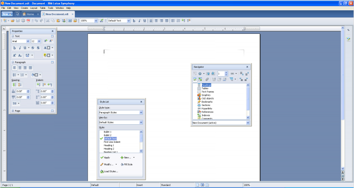 IBM Lotus Symphony: Work Panels as You Want Them
Another major pro of Lotus Symphony is the flexibility of its work panels. They may be placed virtually anywhere on your workspace, thus compensating for the absence of ribbons in the suite. You can try and find the most suitable location on the screen, customizing the application the way you want.
3. LibreOffice
This suite is a fork of one of the oldest productivity packs, OpenOffice.org, which used to be developed by Sun Microsystems. That company was bought by Oracle in 1999, but managed to lead a relatively thriving existence until February 2010, when it was merged with its owner. Since that time, OpenOffice.org has been in a state that suspiciously resembles coma. That's why the most enthusiastic members of the suite community started their own project, based on the old source code. As time passed, this project got the name 'LibreOffice'.
First of all, it should be noted that this package is mostly used on Linux, where it is the default office suite, and Windows is but a secondary platform for it. However, there is absolutely no difference between the features the pack has on the two OSs.
The major drawback of LibreOffice is its old-fashioned interface, which is little better than that of Kingsoft Office. It takes you ages to find an intended option if you don't know where it is from your previous experience. My personal favorite in the nomination 'The most inobvious option in LibreOffice' is the Font Color button. Just take a look at it:
 THe Font Color Button in Libre Office:Not That Obvious
Done? Okay, now imagine that you don't know it is the Font Color button and you have to quickly find it in 5 seconds, otherwise a large bomb will detonate and blow up a whole city quarter. See? You'd stand no chance.
Another big con is that the Microsoft guys seem to have done something about their formatting algorithms; so Microsoft Office files, when opened in freeware suites, have a slightly different layout. Moreover, if you change as much as a single letter, a single tiny interval, or spacing in a single two-line paragraph, the entire document layout gets screwed up even in the Microsoft programs. This applies to all the suites I have reviewed in this article, but LibreOffice's example is the prime one.
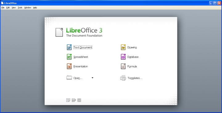 The Office Hub in Libre Office: Way Handier than the Way You Work in Microsoft Office
Well, LibreOffice seems not to have taken only the bad things from its competition. For example, it shares with Lotus Symphony a nice feature I call 'Office Hub', which we miss so much in Microsoft Office. What is it, then? This Office Hub is in fact just a selection screen, where you can choose the type of the file you want to create. In other words, you don't have to search for an icon of Word, Excel or whatever the application is called in this suite; all you have to do is open the selection screen and press the button 'Create a spreadsheet'. Still, I hold the Office Hub in Lotus Symphony for the better one, since it is combined with the browser-like structure of the pack there.
***
In brief, the free and shareware office suites still fail to surpass Microsoft Office in terms of the amount of available features. However, their usability ranges from 'bad' (Kingsoft Office) to 'cooler than Superman' (IBM Lotus Symphony), with the latter programs actually made in a more ergonomic way than the Redmond suite.


2. I wouldn't say that this suite is the best free open suit ever created, but in comparison to the great many other programs of this kind it is a decent thing to use.
3. It's not as popular as Microsoft Office because the functionality of IBM Lotus Symphony is a bit inferior to that of the Microsoft suite, and because its design is not as trendily rich with ribbons as that of Office, and, lastly, because less people know about it. Almost everybody who uses a desktop knows about Office, and more than often has little or know idea about alternative office suites. The situation resembles that with different desktop OSs: the majority of the users worldwide has never heard about anything but Windows OS.